Website powered by

Wooden Cabinet - Break Down

Making Of / 28 January 2020

I’m writing this to share some of my methods and workflow from when I made my ‘Wooden Cabinet’ asset.

I want to share this because I’ll be covering some areas I wish I could have read about online a few years ago myself.

Please note; This is nothing special. More experiences artists will probably roll their eyes at what I'm writing.

Goal of the Project:

I haven’t been happy with the level my art has been on for a while - I have often felt like I am even decreasing in artistic or creative ability. I have struggled with what I felt was very simple tasks in personal projects and during art tests. The negative affirmation has created a degenerating loop and further cripples me creatively, as well as losing me several job opportunities.

My goal in making this asset was to push myself a little. Give myself room to try different things without being under pressure of having to impress or deliver. And hopefully feel a bit better about where I’m at.

Target:

I wanted to make a high-fidelity asset. Visually ~realistic~ and pleasing, technically optimized (for real-time rendering) and a time efficient process.

To break that down, I want: As high visual quality as reasonably possible. As high texel density as reasonably possible. As few polygons as reasonably possible. As few textures as reasonably possible. As small textures as reasonably possible. As few materials/shader instances as reasonably possible.

Final Result:

Before I dive into some methods and workflow tips & tricks, I just want to point to how it all turned out.

You can see visual result here: https://www.artstation.com/artwork/ybYGmJ

Technical result:

3286 tris / 1857 verts. Three 2048x2048 texture maps (Base Color (alpha), Normal, MRA). Two different shader set ups (one for the opaque surfaces and one for the glass) - still using the same texture set.

While there are a few areas where I could reduce the polygon amount without much visual downgrade, I think I’m within reasonable numbers. There are also some empty space, though not a lot, in the UV-map that could get filled out.

Process:

Reference:

Always use references and use more references. I used this cabinet as my main reference. I took several photos of it with my phone camera last summer. Though some areas were a bit hard to photograph and the lighting condition couldn’t be helped, I managed to cover most angles to get a full understanding of the furniture.

Diverging from the reference:

There are some notable differences between the reference and my finished 3D asset. Most of these changes were made to increase the readability of the asset from a distance.
For example, the locks were made simpler in shape. The plaques were added to break up the uniform, wooden surface.

Challenge - small and low number of textures:

After running some early, quick tests, I decided on a texel density of 10,24px/cm = (1024px / 100cm). I wanted texel density this high so I could keep the textures detailed enough to get some good looking close up renders. This means that a 2048x2048 texture covers a 4m^2 area.

The asset is approximately 100x240x50cm in dimensions, meaning that the exterior has an approximate 7,2m^2 area. Adding the interior and accounting for the non-uniformity of the shapes more than doubles this. And adding the necessary padding between UV-shells would make it well over 20m^2. And of course, there is no way to fit 20m^2 into an 4m^2 area.

EDIT: If you want to know more about texel density, check out this resource by Leonardo Iezzi: https://www.artstation.com/artwork/qbOqP

This simply means that I can’t have unique UV-islands for the entire cabinet if I want a texel density of 10,24px/cm and keep to one 2048x2048 texture set. So another approach was needed.

To keep the texture size and number to a minimum, I used a mix of different techniques:

  • I use a trim sheet along the bottom of the textures (blue), to where all edges and trims are mapped to.

  • Most wooden surfaces have overlapping UV's (orange), with a few exceptions where I decided unique details were necessary (yellow). The shells with unique UV space are also very noticable and cover large parts of the front of the cabinet.

  • The glass is mapped to its own area but within the same texture set (light blue).

  • The top margin of the textures are reserved for mesh decals, like the metallic plaques, locks (purple) and the feet (red).

Creating the trim sheet:

I started by just blocking out the entire cabinet, to get all the proportions and separate pieces I saw in my references.

After I had all pieces and refined some of the shapes, I simply made a copy of every type of edge and trim I had on the cabinet. Anything that wasn’t just a flat surface and could be simplified into a trim was made into a 200cm strip and mapped to the bottom of the texture. This is how I concluded what should and what shouldn’t be part of the trim sheet.


I then made high-poly variants of all the trims. Aside from just adding details and fixing smooth edges, I also made sure to add some extra geometry to the backside of the high-poly trims. I did this to create more believable transitions between the trims and flat surfaces as well as getting smooth edges at 90 degree angles.

Mesh Decals:

The hinges, locks and plaques stick out from the rest of the asset. It draws focus, so I made sure to slightly increase the UV space they occupy to make sure they looked detailed enough.

Texturing:

I made the basic wood pattern in Substance Designer and imported it into Substance Painter where I finalized the textures. I won’t be going too much into the wood pattern creation, but here’s a screenshot of the essential parts.

When I was working in Painter, this is where I noticed that I needed some unique UV space for the bottom shutters and middle hatch, since they needed some extra nuance shifts. So I just went back and reorganized the UV map a bit to allow for this.

I made the glass and fingerprints by just slightly altering the opacity on the glass and changing the roughness. The fingerprints are painted and smudged with different intensities.

Finally, I added about three layers of fingerprints and noise smudges to create a general roughness variation over the entire asset.

I hope this made sense and is helpful to someone, or that it at least gave some insight in how I think.

Feel free to ask questions if something is unclear, so I can make revisions!

Meet Knight MAT

General / 01 June 2019

No breakdown or anything today, just some self-promotion!

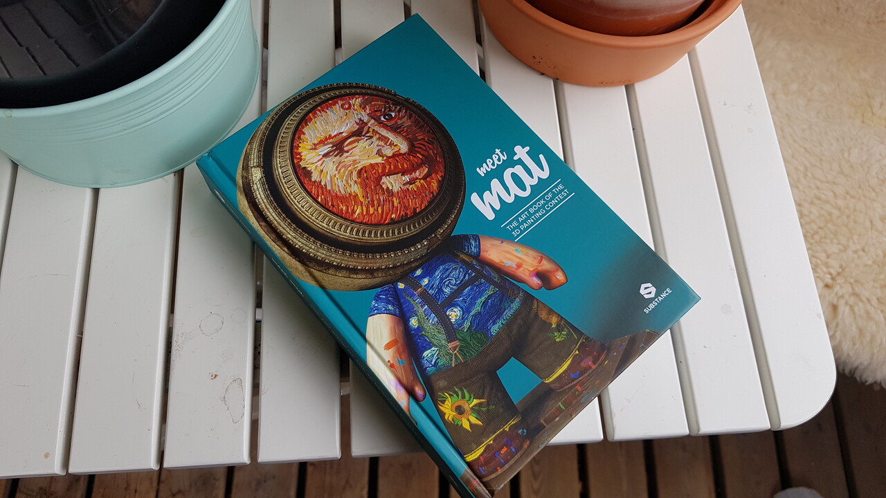
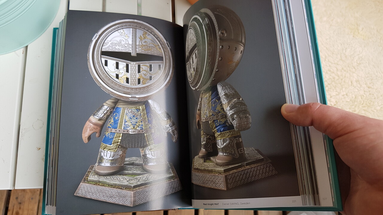
I just got my "MeetMAT: The Art Book of the 3D Painting Contest", you can find my contribution "Meet Knight MAT" at pages 220-222! You can also see some more renders (and a marmoset viewer) here, on ArtStation, from when I uploaded them ~two years ago!
While this isn't my most recent or best work, it's one of the few pieces I've ever done that have made it into some sort of printing (so I'm really happy and proud of it).


Uniformal Scaling and Offsetting - the Transformation2D node

General / 15 May 2019

I briefly showed one of my function graphs in my 'Key Ring Generator' pieces about how the key's head scaling worked. I wanted to discuss that particular feature a bit more, but I also didn't want to got too off-topic in my documentation/breakdown. So I figured that I'd make a separate blog entry about it instead!

This is nothing new for experienced Substance Designer users or anything revolutionary at all. I just want to show a specific case of when a bit of math and dabbling in the function graphs can automate an otherwise tedious and manual process.

In my 'Key Ring Generator', all key heads border the bottom of the canvas (so that no manual re-adjustment to the offset is needed to assemble a full key). This poses a problem, because they can't be scaled using the Transformation2D node without also having to adjust the offset to keep the keys bordering the bottom of the canvas (because the Transformation2D node scales in relation to the center of the canvas).

I absolutely do not want something like this to limit what my graphs can do or that the user have to manually adjust the offset whenever the user scales the key's head.


So lets take a look at how the Transformation2D node works and what we got to work with:

This is what the essential transformation settings look like in an unmodified 'Transformation2D' node once we click the "Matrix" button (this is where we see the state of the Transformation2D node, it does not reset after changes unlike the other GUI).

These are three instances of the Transformation2D node. They are all uniformly scaled versions of a hexagon, that borders the bottom of the canvas, and offset so that the hexagon still borders the bottom of the canvas:

With these cases, we can see the relation between the 'transform matrix' and the 'offset'. It's absolutely necessary that we observe multiple cases, as some patterns between the numbers may look like a relation but are just a coincidences.

Offset = -('Transform Matrix X1' - 1)/2  is the relation we're looking for, which keen minds will recognize from the 'Key Ring Generator' documentation:

(In this case, 'Transform Matrix X1' is called 'scaleoffset' which is, in hindsight, a very bad and confusing name for that specific variable).

Cleaning this up and adding more approachability and utility to the function graph, it looks like this:

(1 divided by 'scale') is the 'Transform Matrix X1' in this case. This way, we can input a value between 0 and 1 where a lower value means a smaller scale. 'x_offset' and 'y_offset' are additional exposed values that control the offset on each axis. (x_offset = 0 , y_offset = -1) means middle of the x axis, at the bottom of the canvas.

Just for comprehensive sake, here's what the 'Transform Matrix's function graph looks like:


And that's how I automated a small portion of my graphs for the 'Key Ring Generator', to avoid manual inputs.

One extra little thing I wanted to mention, because I don't think this is a very visible feature in Substance Designer but can be very useful: This is what happens when we start inputting non-uniform numbers into the Transform Matrix.

Well that's that. It's 03:30 (am) and I really need to stop. Good night everybody!

Mountain Materials Breakdown

General / 27 March 2019

I just finished typing up a breakdown of my latest project in a new thread at Polycount: Please check the thread out!

Please check the thread out!

Please check the thread out!

Vinyl Chair Padding - a small break-down

General / 29 January 2019

I've been asked what my process was for my 'Vinyl Chair Padding' material, so I though I'd make a small break-down of the height-map and some of it's elements. I should mention that this is something I did in ~4 hours a late night, meaning that there are definitely better and more precise approaches. This is all just stuff I came up on the spot or had wanted to try for a while.


Base:

I started with a 'Tile Random' (the 'Tile Sampler' or any similar node also works fine) to make a 4 by 4 Paraboloid pattern, scaled them up to 1.5 (make sure to set the tile node's blending to 'max-lighten' or the shapes will cut into each other) and then used the 'Safe Transform' to rotate the pattern 45 degrees.

I simultaneously made a similar pattern with smaller, blurred Paraboloids: This other pattern is used a lot in the graph to warp other shapes and patterns to make them flow with the base shape, but is never itself inputted to the height-map. (I'll refer to this as "my warp pattern" for the rest of this article).


Damage:

I generated a black-and-white image to mask out the damage and wear.
I took a regular 'Clouds 2' noise, warped it with my warp pattern, then a 'Slope-Blur' (with a 'Perlin Noise' as slope input). I use the 'Hightpass' to flatten out the values a bit, then I drag it through a 'Histogram Scan' to generate small white islands. I use and edge detect on these small islands to smooth and round their silhouette a bit, and then blend the new edges over the islands with the 'Add' blend mode. Then I add in some extra noise by dragging a 'Directional Noise 4' through a histogram. Finally, I use another 'Slope-Blur' at a very low intensity to rough up the edges a bit.

This pattern is important for many other parts of the graph, often used as a mask.


Buttons:

By setting the 'X Amount' to 4 and 'Y Amount' to 8, dragging the 'Offset' to 0.5 and the 'Global Offset Y' to 0.5, the buttons are places right between the cushions in the height-map (except for where I mask them away).
The Button shape is a paraboloid that I modify with a 'Levels' and a 'Curve' node to a more appropriate shape.

I use and inverted variant of the damage pattern as a mask input in the 'Tile Sampler' to remove the buttons from the damaged areas (Mask Map Threshold is set to 1).


Ripped buttons:

This time I want to generate shapes where there are not buttons (I use the original, non-inverted damage mask). The 'Tile Sampler' generates 'cones' that I modify with a 'Curve' node (see image) and then warp it with a 'BnW spots 3' noise.


Stretching and tugging:

This is definitely something that could do with improvement. This is just a quick and easy way.

Over the cushions:

I use a 'Crystal 2' noise, directional warp with a solid gray-scale pattern (to prevent the stretching from overlapping between cushions) and then warp it with my warp pattern (to simulate that the stretching is following the shape of each cushion). I do both a horizontal and vertical pattern like this. I then blend them both, very faintly, in to my height-map.


Under the buttons:

I use two differently randomized 'Starburst' shapes as pattern inputs in a 'Tile Sampler', in the same exact arrangement as I generated the buttons. I add some rotation and scale randomness as well. I then warp the starburst pattern with my warp pattern and the base of the height-map (slightly, just to make them flow with the shapes). Before I blend them into the height-map, i adjust the values a bit with a 'Curve' node.

No buttons:

I want the padding to bulge out where the buttons are missing. I use a similar 'Tile Sampler' as I did with the ripped-button marks, only with larger sized cones. I warp the cones with my warp pattern and then I use a 'Blur HQ' with a high intensity (the soft fall-off is important for a smooth blending). I adjust the values with a 'Level' node before I blend it into the height-map with 'max-lighten'

Hey, are you reading this?


Padding:

I use the damage mask as a base, blur it a bit (this is what makes the padding bulge out) and bring up the black values to mid-gray (0.5 linear). I multiply a blurred version of the basic height map on top of it (making the padding follow the shape of the entire material), subtract the 'Dirt 5' noise from it (this is what makes the spongy look) and then add in some extra bulging where the buttons are missing.


I mask the padding with the damage pattern.

Edges:

To add a thickness of the fabric around the damaged areas (and not just have a flat transition between fabric and padding), I take the damage pattern, blur it a bit and then subtract the original patter from it (to cut away the areas where the padding is exposed). This way I get gradients surrounding the damaged areas (the fall-off is important or this "lip" won't blend smoothly into the cushions).

To add some more ripped / loose hanging fabric around the damaged areas, I run the damage mask through an edge detect, slope blur it with a 'BnW Spots 3', subtract the original mask from it (again, to cut away the inside areas where the padding is exposed). I blend this damage on top of the edge-gradients with 'max-lighten'.


I hope this is of some help to someone. Let me know if you think I should continue bothering with these blog posts.


If there's anything unclear or something else you wish me to cover, just ask!

Stylised Dungeon: Modular set Break-down

General / 29 August 2018

This is a rough breakdown of this project.

I started this modular environment set during a course, held by Kim Avaa (https://www.artstation.com/aava). I have since then scrapped it and started over again - I felt like I had made too many mistakes the first time. The biggest challenge was probably to plan the models so that they would snap together correctly and not break any tiling.

My personal goal with this project was simply to explore and learn a bit about environment art and modularity. The goal with the modular set was to make an easy-to-use asset pack that was generic enough to allow for any kind of level layout and not restrict a level designer.

From what I’ve gathered, my approach is a bit unorthodox. So I will break it down and hopefully teaching someone something new, while also opening up for feedback from others about my workflow.

Placeholder meshes and planning

I spent a lot of time on figuring out the dimensions of the basic meshes. At first, I made the walls 200x200 cm. But I noticed that it felt really off, from both an aesthetic and a modular standpoint. 200x200 wasn’t high or wide enough to fit playable characters; door openings became too narrow, the ceiling needed extra margins to not be too low, etc.

When I restarted the project, I went for a 300x300 cm and 25 cm thick wall instead - I found this to be a much better standard. Having established a standard also made it easier to improvise new pieces later on.

From the basic square ratio 300x300 wall piece, I proceeded to make other modular pieces that fit its’ measurements: 300x300 floor, stairs that ascended 300cm, trims that could cover the 25 cm and 50 cm seams between ceiling and floor, vaults with an inner radius of 150cm and 300cm, etc.

Textures

I then continued by creating some tiling materials in Substance Designer. I spent a lot of time on these, since they were going to be the base of the entire project and the style-defining content.

I aimed for exaggerated but realistic shapes; rounding the corners a bit extra, increasing the crack intensity, deeper slopes, higher values on the warp-nodes, etc. The goal-post was somewhere between a hand painted look and a semi-realistic style.

My general workflow for creating materials in Substance Designer is that I start with the macro shapes in the height map, then I add the micro shapes. I then use the completed height map as a base for both the base color and the roughness.

During this process, I always have the height map connected to a ‘normal sobel’ with a high intensity and a ‘hbao’ node - A sharp normal and AO helps visualise the height information much better and avoid any artifacts. This way I also have full control of the final AO through the entire process.

I usually start brick patterns with several tile-random nodes. Both share parameter values, only that one outputs a random grayscale square pattern and the other a randomly rotated gradient pattern. I run an edge detect and then warp all three patterns. These are good base patterns that I will reuse several times later in my graph.

After that, I used the  flood-fill node and generate some more random gradients, which I then multiply over the warped edge detect. I then warp the result some more with a perlin noise. And that’s how I made the basic shape of the rocks.


Underneath is the height map for the sand: I “Slope Blur” a perlin noise on itself. Multiply it with a blurred cells noise. Invert it and then warp it (with another perlin noise as warp-input). I then run it through a highpass (to flatten the values a bit). Lastly, I multiply another warped cells noise (same perlin noise warp-input).

One more thing that I think is worth mentioning is the color. I grab different points of my height map, run them through dynamic gradient nodes. I then blend all of these different colors over each other, to create a non-uniform and layered base color.

I also made some small variations of all materials, for vertex-painting to add some diversity to the scene.


Modeling

hi-poly

I used the height-maps that I made in Substance Designer in Maya to generate hi-poly models.

I’ll do a quick step-by-step on how to do this: I started with a high resolution plane.

1) Go into Animation mode. 2) Expand 'Deform'. 3) Browse down to 'Texture'. 4) Make sure it's set to Normal. 5) Click 'Apply'. 6) Make sure the a 'textureDeformerHandle' object is in the outline. 7) Click the checker in the Attribute Editor. 8) Choose File

The Attribute Editor should allow you to browse to your image by clicking the 'image name' folder. Then select your mesh (the plane in this case) and brows to your 'textureDeformer' in the Attribute Editor, where you can increase the strength of the map.

low-poly

With the hi-poly complete, I started quad-drawing on top of it: I found that the most optimized and best looking approach was to do it by hand. Other ways would be to reduce the hi-poly with automated algorithms or simply push a (low-resolution) subdivided plane up against the live-surface hi-poly - I did not find these results good looking enough compared to the slower method. Since I was already planning on reusing the mesh for other models, I figured that it was okay to spend a bit of time on the initial base meshes.

I started with just a square, covering the entire hi-poly model.

I added an amount of vertical edges equal to the amount of brick cavities and lined them up. This is just to mark the general edge-flow and it will help all the way through the quad-drawing process.

After that, I inserted horizontal edges, every third right between the brick-rows, to make sure that the edges brought out the basic siluet.

With all this extra geometry, I started moving the vertical edges in-between every single brick. I iterated on the edge-flow: The red lines are where I noticed that I could rearrange, to have more relaxed polygons (to reduce over-drawing and other issues).

With the proper edge-flow, I added the last vertical edge-loops, adjusted them so that they were placed on top of the bricks (creating cavities between all bricks).

Lastly, I made sure that the mesh seamlessly tiled by moving around the edge-vertices by matching them with other adjacent copies of the model.

I had a similar process for the floor and ceiling base mesh.

UV-mapping

I unwrapped all meshes by using the Planar UV-mapping method - This was not only the fastest, but the most accurate way to UV-map these meshes. The front needs to cover the entire UV space from 0 to 1, in a perfect square, to match up with the textures.

Note: Unlike the front side, the back and the sides don’t need any dedicated UV space because they are always supposed to be hidden.

Modeling pt2

With the basic meshes completed and UV mapped (Wall, Floor, Ceiling) I moved on to making variants and new meshes by cutting them up and by using the ‘Deform’-tools in Maya.

I used the available boolean operations to cut out shapes from the basic meshes:

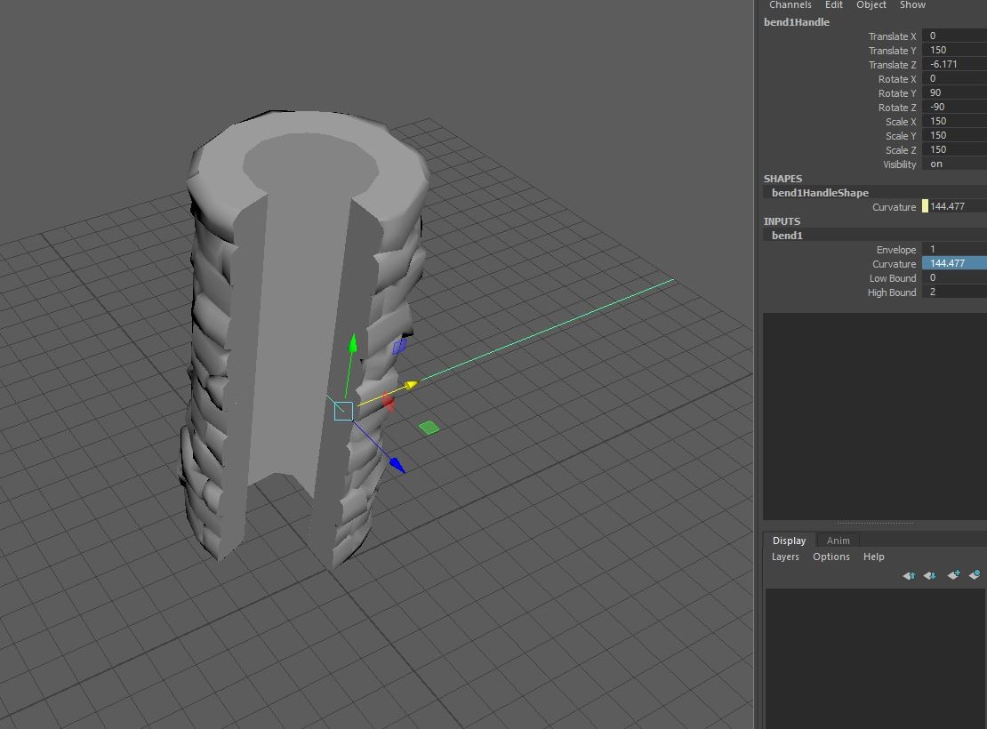
Under “Deform->Nonlinear” I used the “bend” deformer, to wrap a wall mesh around itself and created one of the pillars in the set.

For other shapes, I combined several copies of the wall and cut them down to the correct size:

I made vaults by calculating the circumference of a circle with the radius of the floor’s length, divided by 4: (300*PI)/4 ~ 471.25

I used an external cube as a ruler to get the exact length right.

Note: I always made sure to retain the UV when stitching and cutting in the meshes.

With the approximate length on the mesh (471.25 cm), I deformed it into a quarter circle (with a radius of 300cm).

I then mirrored the mesh and merged them together - This way the vault won’t break tiling with the other walls on either side.

I made several different sized vaults this way, both up and down segments.

Sculpting

For the stairs and all the trims in the set, I did some quick sculpting in ZBrush. I basically just took cubes, dulled down the edges and then created some flat surfaces:

I made a few variations that I later used to build the stairs and other models.

The low-poly variants were made in Maya. Baked them all down on a single atlas and then I did the rest of the texturing in Substance Designer by just re-using my earlier materials.

I also did some deforming in Maya on these trims to make matching shapes to the cut-outs of the base mesh.

Anything I missed or should be more clear about?

Micro Tutorial #3 and Stylized apartment break-down

General / 02 July 2018

(WARNING! My method worked well for THIS game project, it is not a universal solution to graphic optimization and there are probably a thousand ways to improve upon this)

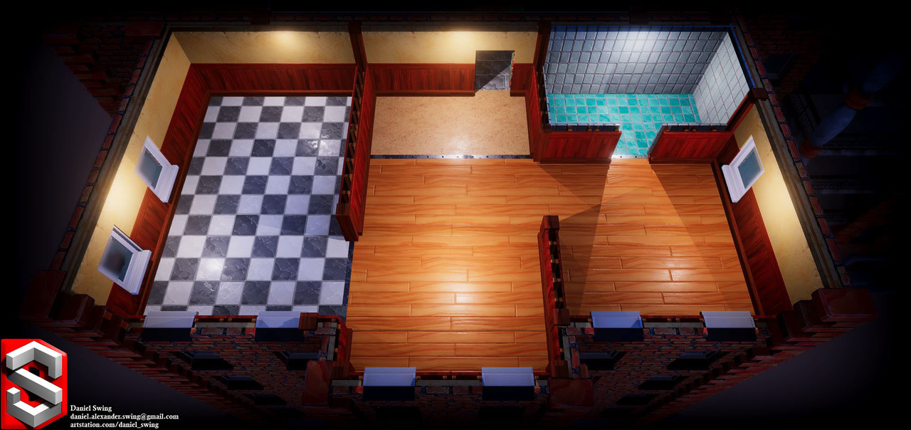
I'm back with a little break-down of my recent work on a small game project!

I've covered some techniques in Substance Designer before, so now I wanted to give some pointers when it comes to implementing textures into a game engine as well. It's one thing to make nice looking textures, it's another one to make it actually work in a game - Both are extremely important when it comes to game development, of course.

I'll bring up some decisions I made during my process, on how I broke it down and optimized this scene. I used Maya for modeling, Substance Designer for texturing and Unity is the game engine - though my theory is applicable for other tools as well.

Level-Designer Friendly

Nobody knew what the final layout of the level was going to look like or when it would be finalized - I had to make building blocks and modular pieces so that the level designers could work and iterate on their design, while also not waiting for them to finish up before I finished my work.

I bring this up because this greatly impacts what is "reasonable" optimization. To minimize draw-calls, one could have made the entire scene into one model with one material. That was not possible in a short project such as this, without impairing other areas of the game development process, such as the level-design.

Textures and Resolution

The camera is almost static, not much movement or zooming will be happening. Almost the entire scene will be visible at all times. Knowing this design decisions, I could adapt my texturing work-flow:

I had ~1920x1080 pixels to cover in textures (I'm assuming the screen resolution here). This means that one 2k texture (2048x2048 pixels) would technically cover more than the entire screen. This means that a 2k texture will never be displayed at full resolution in the game, which makes it somewhat pointless to put multiple 2k textures in the game when they will definitely get mip-map:ed down by the game engine.

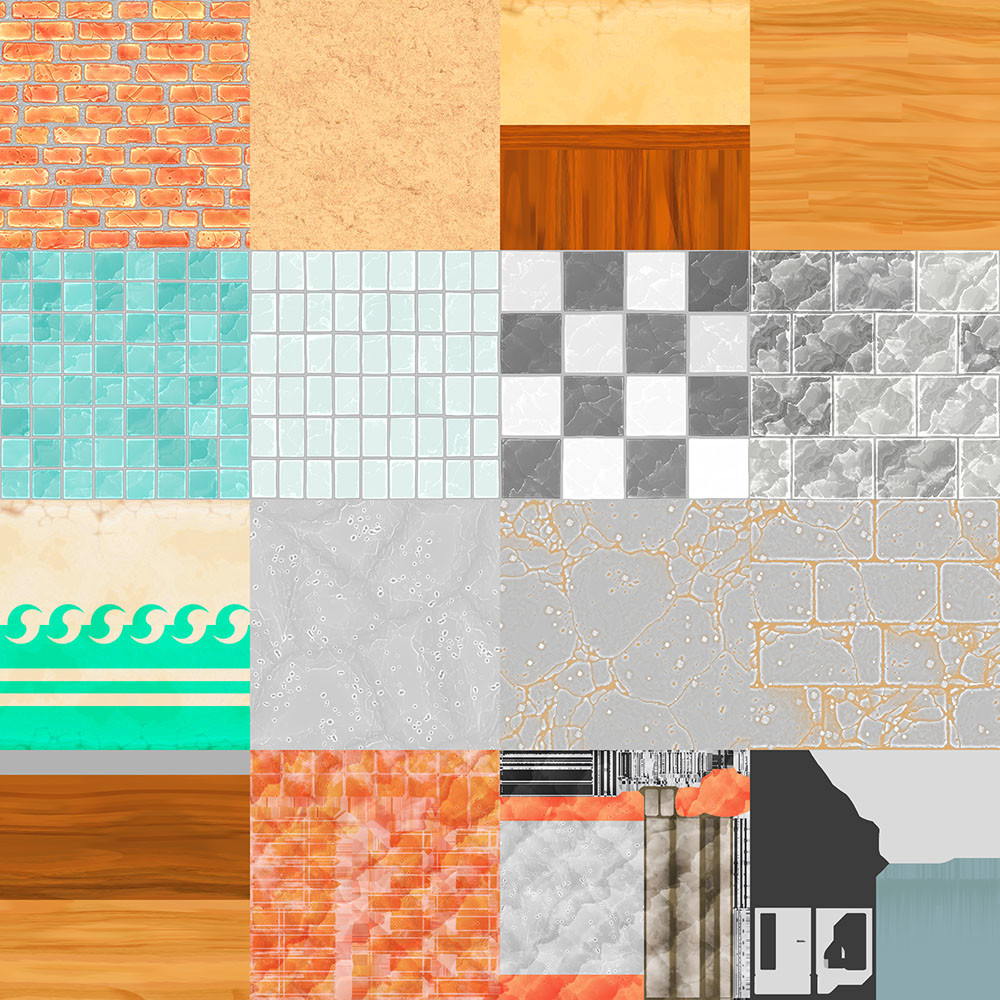
What I did was that I put all of my textures into one atlas: one 2048x2048 split into 4 by 4 number of sections (I used Bruno Afonseca's Atlas node). Note: remember to add some padding between the textures.

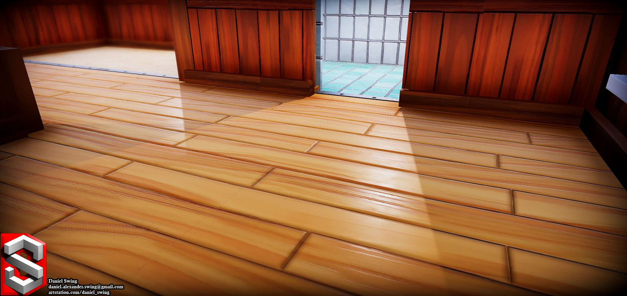
-This means that the computer only needs to fetch and keep one texture in memory, instead of 16 different 512x512 texture maps. In hindsight, I could probably have pulled the individual texture-sizes down to even lower than 512x512 (As you can see, the 512x512 sized textures still renders "fine" on this very-close-up shot, that the game it self will never show).

UV-mapping

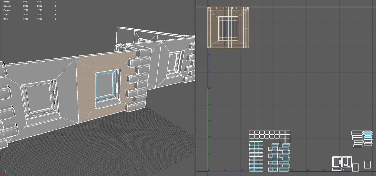
I mapped the UV's of my models according to the texture atlas - remember padding!

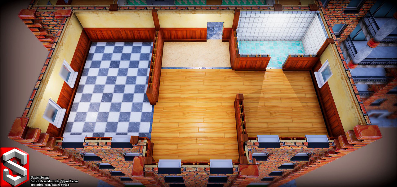
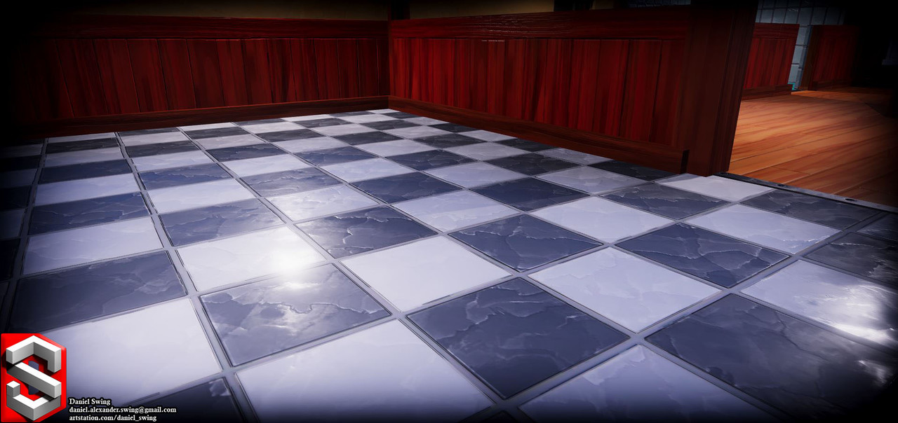
However, not all interior walls look the same, they use different sections of the texture atlas (see screen shot, wooden panel and bathroom tiles, etc). Instead of making additional models and UV-map them to other UV-coordinates for each wall-type, I built a custom shader so I could cut and paste parts from the texture atlas into the correct UV-coordinates in the material instances (for example, move the bathroom tiles to the interior wall UV-coordinates) - This does mean that each set of uv/texture alterations needs its own material instance.

(I used Amplify Shader, since Shader Graph isn't fully implemented yet and Shader Forge doesn't really work for resent releases).

Texture Packing

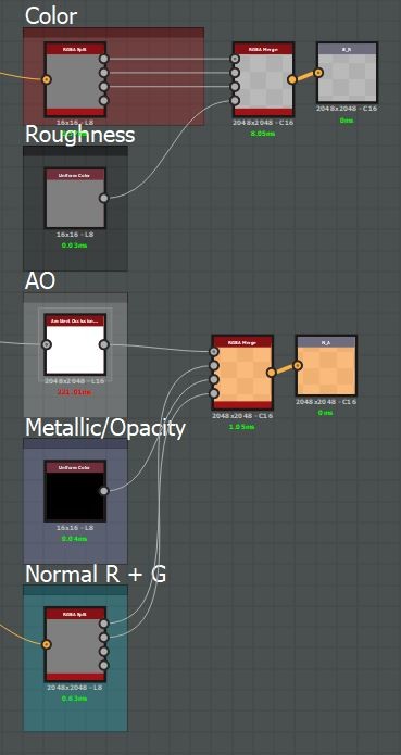
I further went on to pack my texture channels so that I only needed two texture maps to define my materials.

Texture 1: Base Color in RGB and Roughness in Alpha

Texture 2: AO in R, green normal channel in G, metallic or opacity in B and red normal channel in Alpha

(The green and alpha channel keeps the highest bit-depth, which is why I pack the normal information into them, as well as the roughness)

This way, I only need to fetch two 2048x2048 texture maps to cover my entire scene with all material information I need. Of course, this packing also needs to be "un-packed" in the shader accordingly.

All in all: This scene is textured with one 2048x2048 texture atlas, uses only a few material instances and can very easily be altered and iterated on.

Is there anything I left out? Anything I didn't think of or something I could improve? Is my writing unbearable to read? I'm happy for any feedback or questions!

Micro Tutorial #2: Concrete and Cracks!

General / 13 March 2018

This micro-tutorial is meant for somewhat adept users. I will skip over most details and only show small aspects. Today I will be showing you some Substance Designer tips and tricks from some of my most recent work on concrete and glass. - I'll give credit throughout the tutorial to people who helped and inspired me.

Link to the 'Dilation Or Erosion Filter'

Concrete

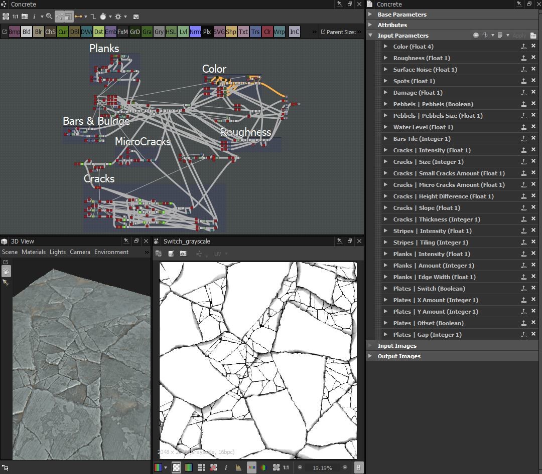
We'll start from the top and dive in on the details! Here you can see the full graph (which we will cover about 10% of) and the final crack-pattern.

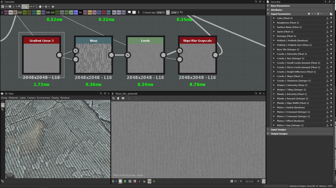
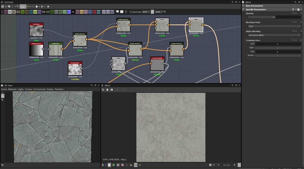
First of all, to get some surface noise going, I applies a 'Gradient Linear 3' and crank up the tiling to 256, then warping it slightly with a 'Perlin Noise' so that the gradients aren't compleatly straight. I then run it through a slope blur with 'Cloud2', then blended it into my height map using the "overlay" blend mode.

The basic color

Here you can see the very basic way I create the largest crack-flakes in the pattern I warp it with a small 'Perlin Noise' and then with a 'Cloud2'. I use a 'nondirectional_warp'-node that I got from Daniel Thiger's Gumroad (I don't know who else to give credit to) - but a directional warp or even a slope blur could render a similar result.

Major credit to Daniel Thiger, I've studied a lot of his graphes, this method is greatly inspired by his work:
I then feed the pattern into a 'FloodFill' to create gradients of the same shapes. I use the 'Dilation'-node to tighten up the gaps between the gradients. I blend in a mix of 'Cloud2' and a small 'Perlin Noise' (to add some noise and un-even-ness in the gradients) and then pull it through a 'Histogram Scan' - I will use this as a mask for where I will put my smaller cracks later on. As you can see, the histogram has the position parameter exposed: That's because I want to be able to tweak it as I go, masking out a larger or smaller part of the largest flakes.

Here you can see a similar histogram, the only difference is that I've set the position of this one to just a little higher that the other one. I invert it and then add it together with the old histogram, to mask out the edges where the large flakes will break up. Again, I use the 'Dilation'-node to tighten up the lines, and then multiply them over the large crack-flakes pattern from earlier. I then multiply in a blurred version of the pattern, so that I get a slight fall-off on the edges of the cracks. The first slope-blur (uses cloud2) is just there to create some small chips in the cracks, the 'Curve'-node adjusts the fall-off of the cracks. The second slope-blur (uses a 'Perlin Noise') is set to 'Min' and is used to pull out some gradients to the side of some of the cracks. The last slope-blur (uses 'Cloud2') is just there to add some chips to those gradients. And lastly I tighten it up again with a 'Dilation'-node.

I repeat this same process with two other, smaller crack patterns. Here you see how I blend them together: I simply use the 'copy' blend mode and use the histogram I generated before as the mask. I do this again but use a histogram that I generated from the smaller crack-pattern's gradients. The 'Directional Warp' is simply to off-set my cracks if they are used on tiles and the 'Switch'-node is connected to the global boolean "Plates - Switch". The last histogram uses a high contrast and a low position, I use ut later on to mask out the cracks or the flat surfaces.

Glass Fracture


I got feedback from Kelvin Tam that my cracks in my factory window could improve by creating radial cracks. So I sat down and experimented with that for a while and this is what I came up with! Here you can see the final result!

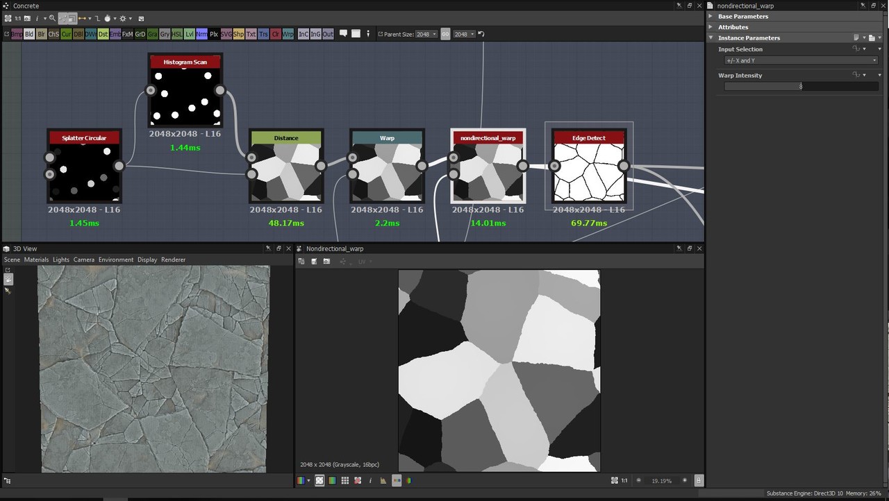
This is the most essential part of the graph. I create two different radial patterns and blend them together, then I warp them a bit. Blending together the two 'crystal' noises was another idea given to me by Daniel Thiger - it's great for warping patterns into a more glass-crack-like pattern.

A closer look at what's happening here: I use two 'Splatter Circular', add them together, use a 'Histogram Scan' with position and contrast at 1 to get a white equivalent pattern to run then through the 'Distance'-node. I then use the 'Overlay' blending mode to combine two different patterns into one. I later warp this node with the crystal noise and then take the final pattern into an 'Edge-detect'-node.

And finally, to add some more cracks on-top of this, I used a method showen to me by Nick Williams over at Polycount. I won't go through it here, you'll have to check a look at his post in the Substance Challenge thread!


Little extra

From my stylized sandstone bricks. This is what I did to get the subtle shifts in the color: I 'max-lighten' a 'Gradient Linear1' and half the value (a 'Histogram Scan' at position 0.25) of a 'Gradient Linear3' with each other. I then warp it with a large 'Perlin Noise', slope-blur and warp it with a directional noise and a flipped directional noise, flip it on the diagonals with the 'Safe Transform' node, warp it a bit more with the 'Perlin Noise'. Lastly, I use a Directional Warp with a similar noise to the crystal noise that I showed up above. I use these three patterns to generate the basic color of my sandstones.

I hope this makes any sense and that it will help someone! If anything is unclear or if you feel like something is missing, please let me know so that I can correct it!
//Daniel Swing